TIPPGEMEINSCHAFT
Submission for the design of the next Tippgemeinschaft 2026 year anthology issue, done by
the students of the German Literature Institute Leipzig. Their wish was to have a minimalistic approach for the cover with abstract illustrations, as well as chapter divider pages for each of
the students’ essays. The cover should contain the illustration, as well as title and subtitle, and option to add the students’ names. Since it should remain minimalistic, my approach was to sometimes integrate the students' initials only.
the students of the German Literature Institute Leipzig. Their wish was to have a minimalistic approach for the cover with abstract illustrations, as well as chapter divider pages for each of
the students’ essays. The cover should contain the illustration, as well as title and subtitle, and option to add the students’ names. Since it should remain minimalistic, my approach was to sometimes integrate the students' initials only.


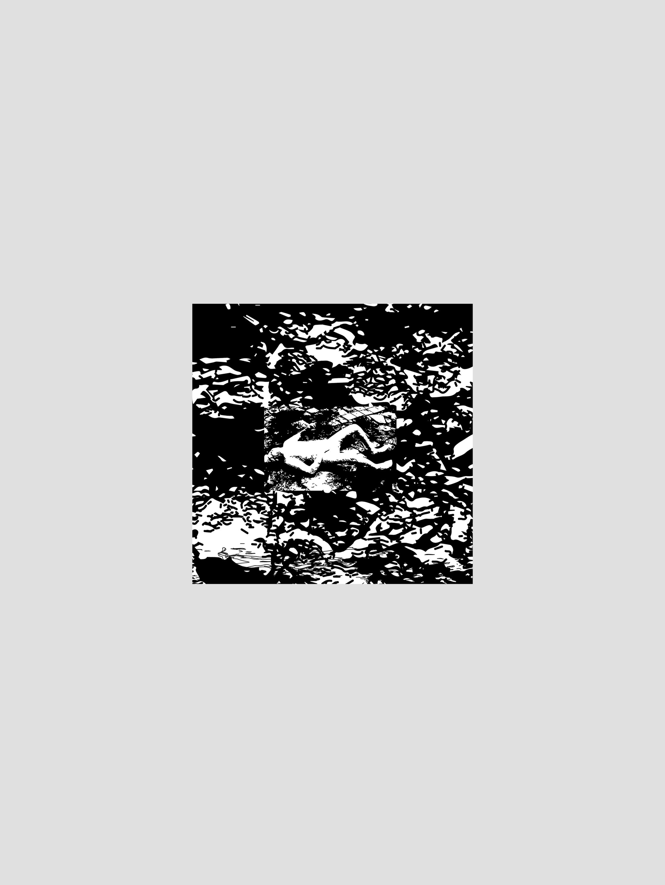
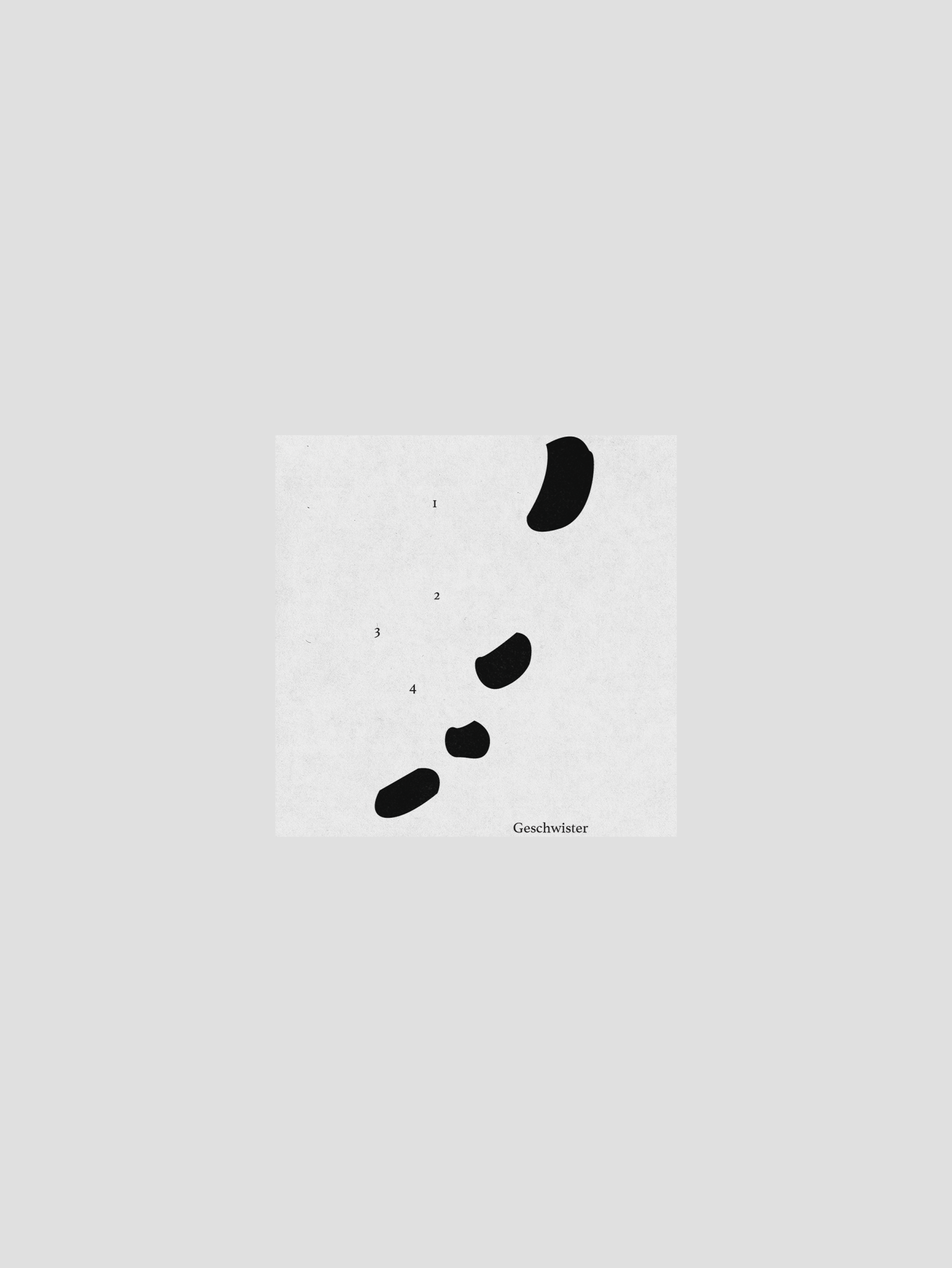
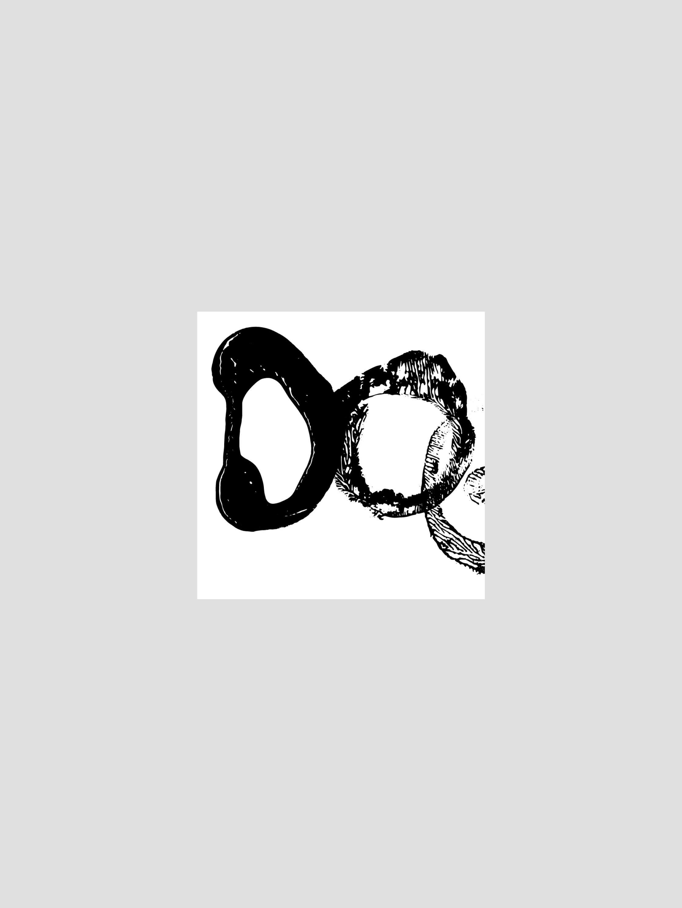
My first graphic suggestion was to use abstract forms done with the Rorschach test print technique, which suggests the multiple interpretations texts can have. Both of the cover options contain the student's initials, and the forms for the chapter dividers could be either dotted, texturized, with shadow or not.


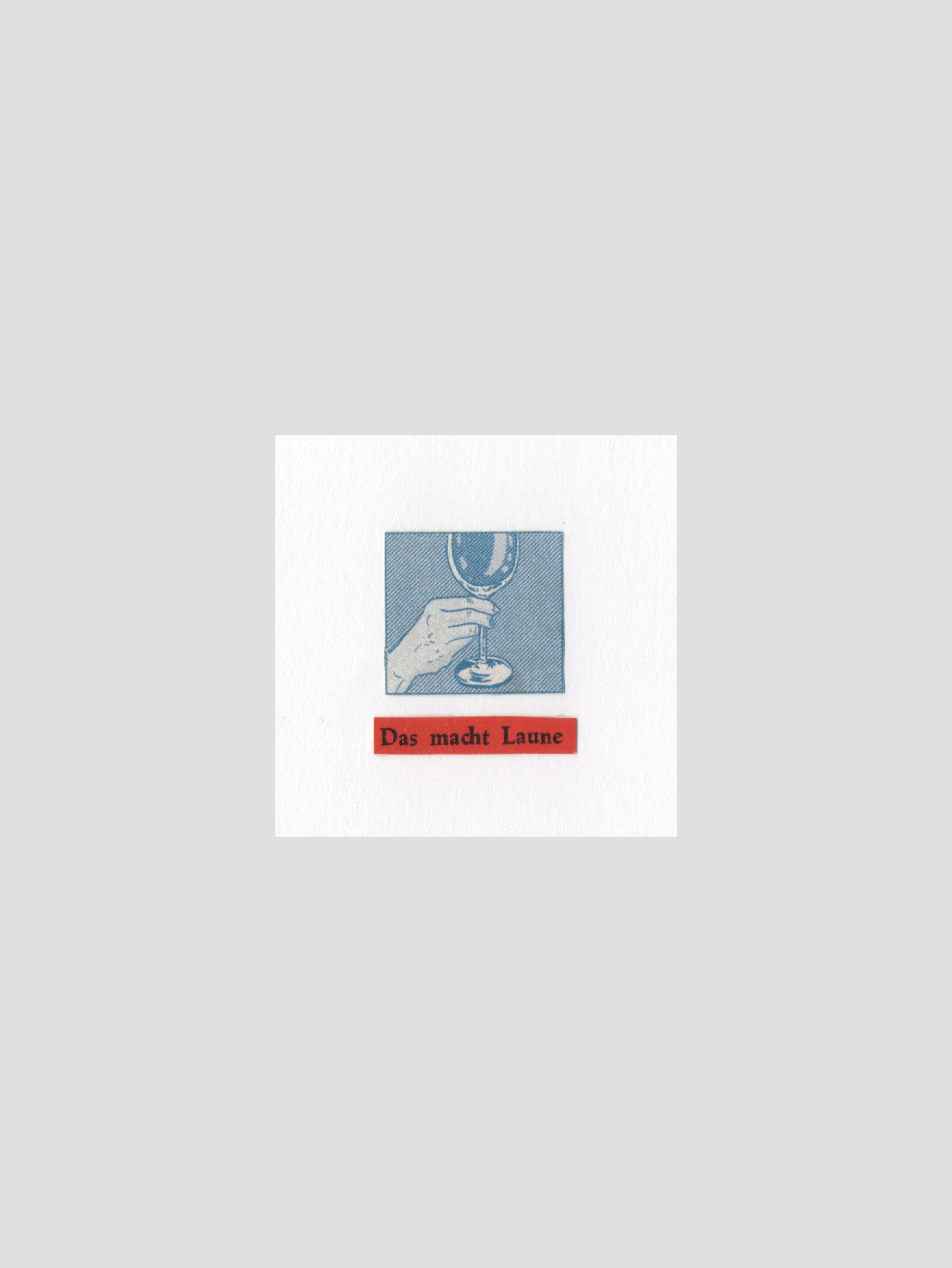
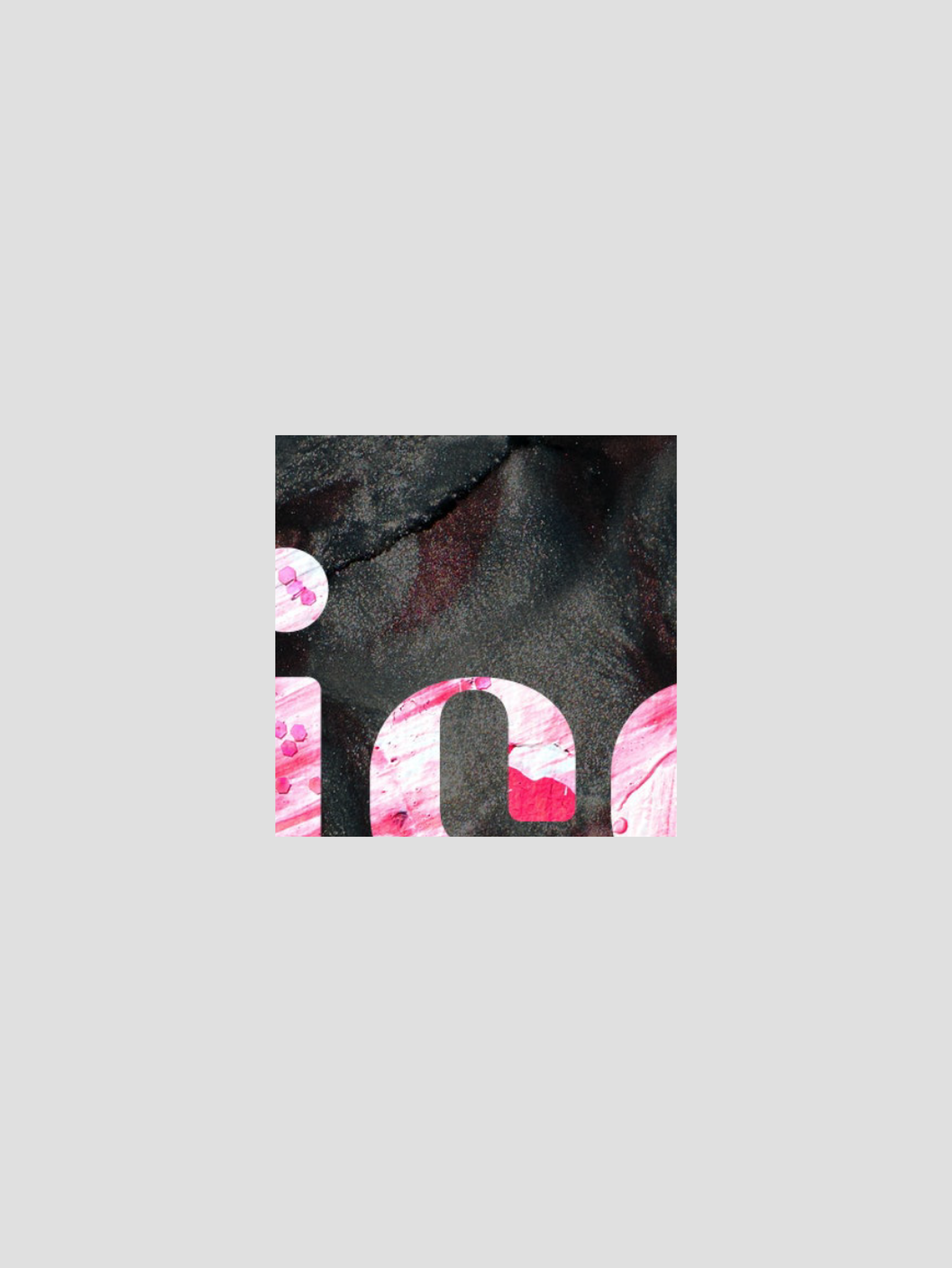
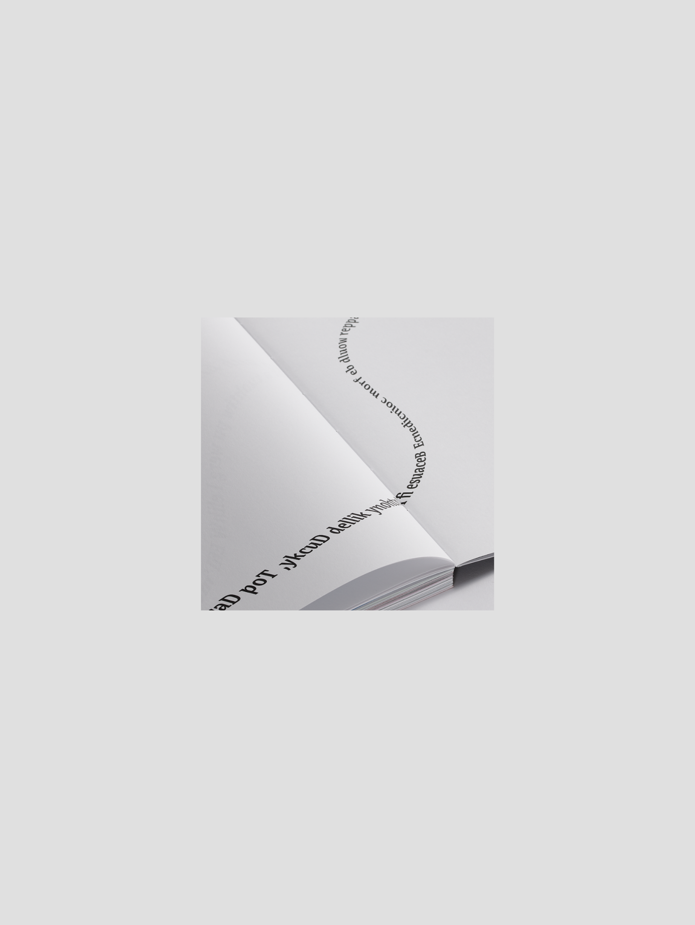
The second approach was to create a series of
small illustrations, each individually assigned to
each student, serving as a personal identification
element. These illustrations could appear on the
cover—either abstractly or as part of a more
structured system—as well as in the index alongside
students’ names, and throughout the publication as
chapter dividers.
small illustrations, each individually assigned to
each student, serving as a personal identification
element. These illustrations could appear on the
cover—either abstractly or as part of a more
structured system—as well as in the index alongside
students’ names, and throughout the publication as
chapter dividers.


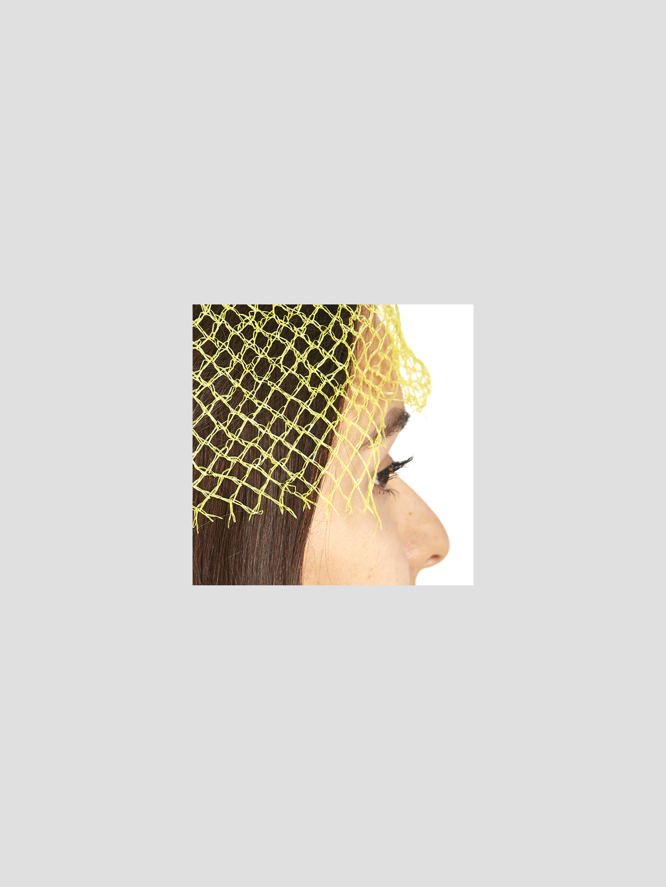
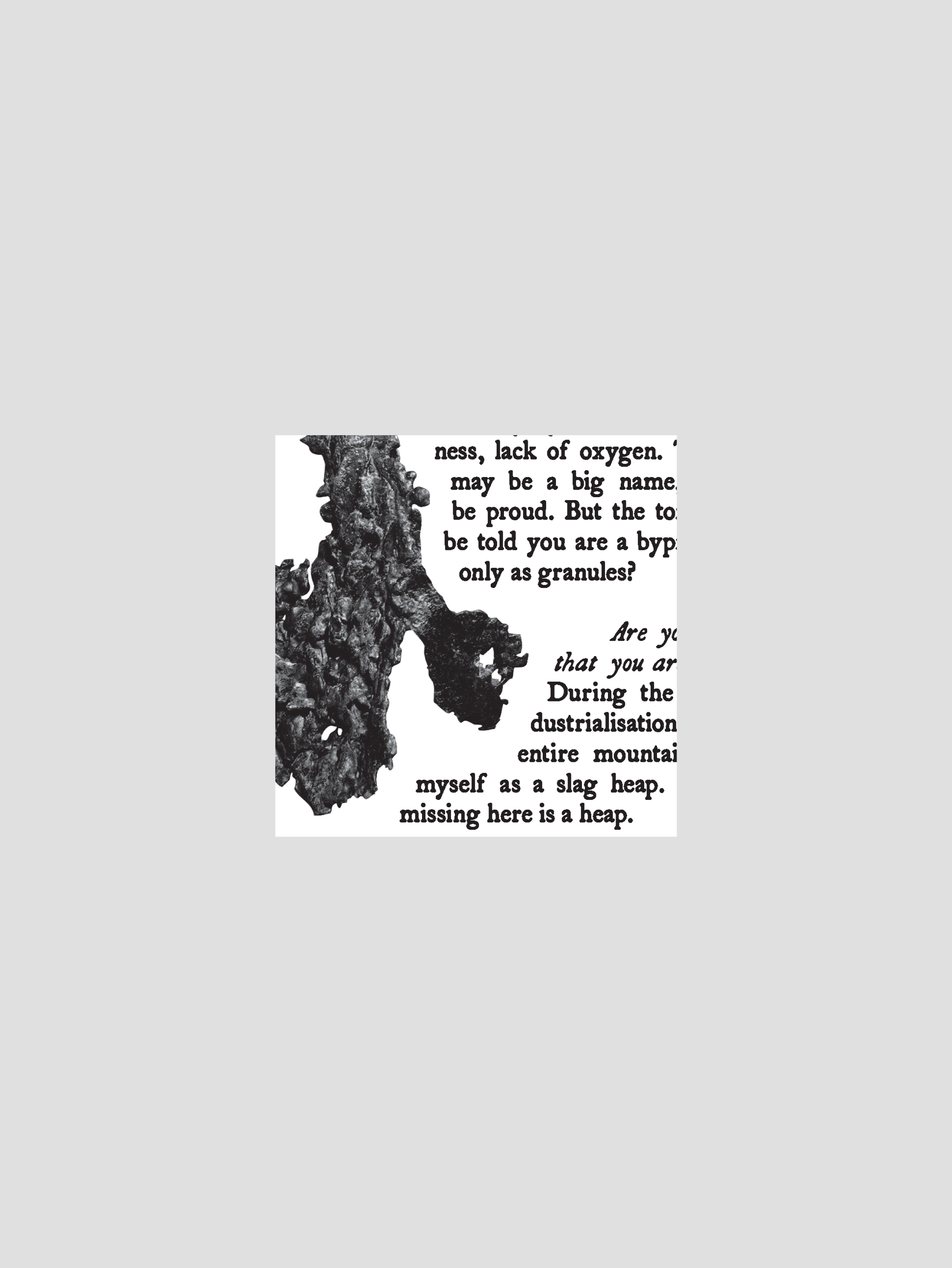
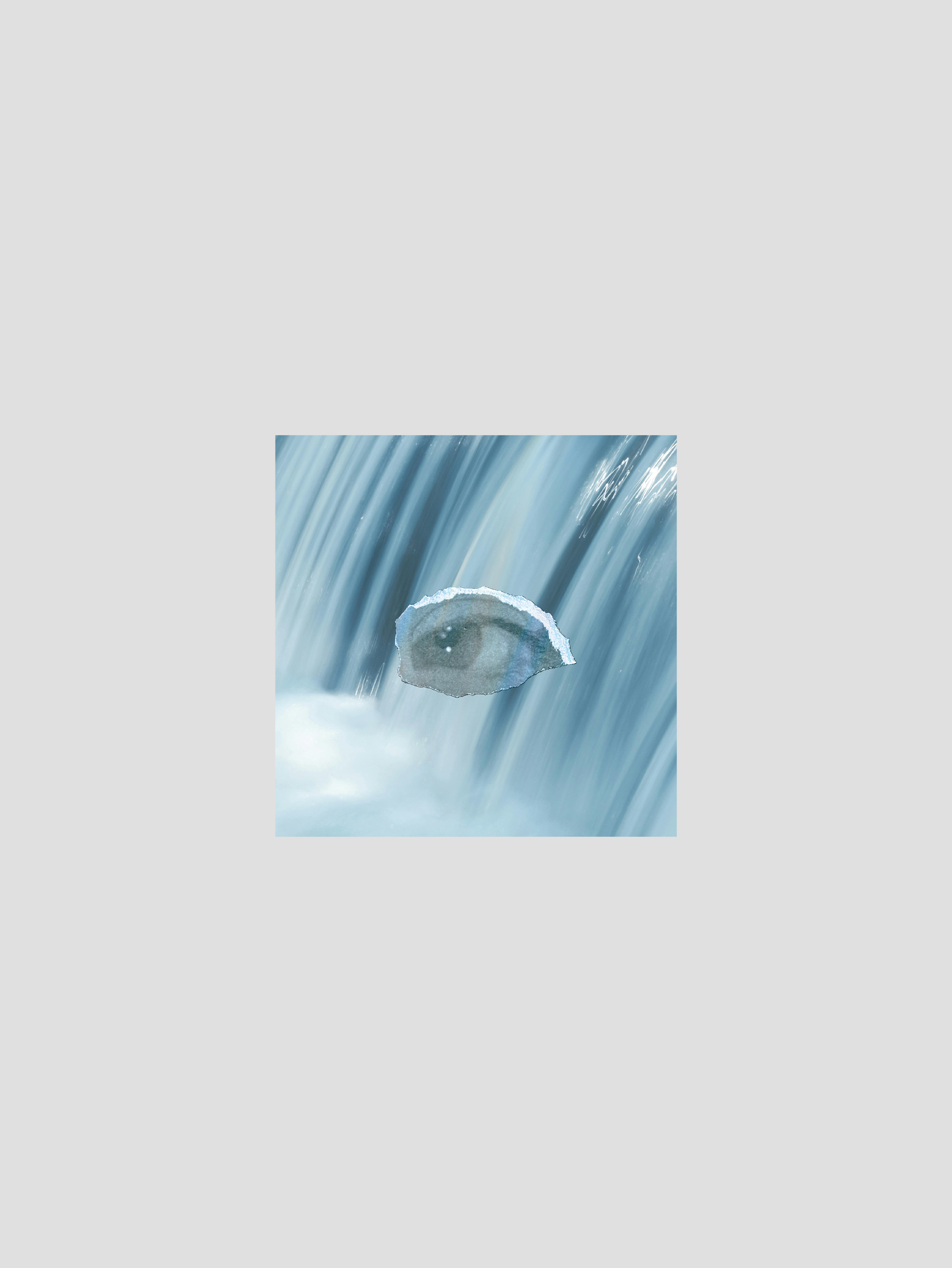
For the third and last suggestion, the idea was to use illustrative elements found
in each of the texts. In the cover, these elements would blend together, creating
an abstract image. For the chapter dividers, the illustrations would appear either
whole and centralized, or bigger and zoomed in.
in each of the texts. In the cover, these elements would blend together, creating
an abstract image. For the chapter dividers, the illustrations would appear either
whole and centralized, or bigger and zoomed in.